接上一节:VitePress搭建博客教程系列(5) – 如何自定义页面模板、给页面添加独有的className和使页面标题变成侧边目录?
九、第三方组件库的使用
我们经常看见UI组件库的文档,这里我们就用element-plus第三方组件库为例子,搭建组件库文档
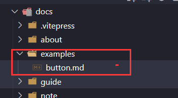
examples:作为组件库示例目录,我们以Button组件使用为例
pnpm install element-plus
安装完成后,在theme/index.js引入element-plus相关文件
import DefaultTheme from "vitepress/theme";

import ElementPlus from "element-plus";
import "element-plus/dist/index.css";

export default {
  ...DefaultTheme,
  NotFound: () => "404", // <- this is a Vue 3 functional component
  enhanceApp({ app, router, siteData }) {
    // app is the Vue 3 app instance from createApp()
    // router is VitePress' custom router (see `lib/app/router.js`)
    // siteData is a ref of current site-level metadata.
    app.use(ElementPlus);
  },
};
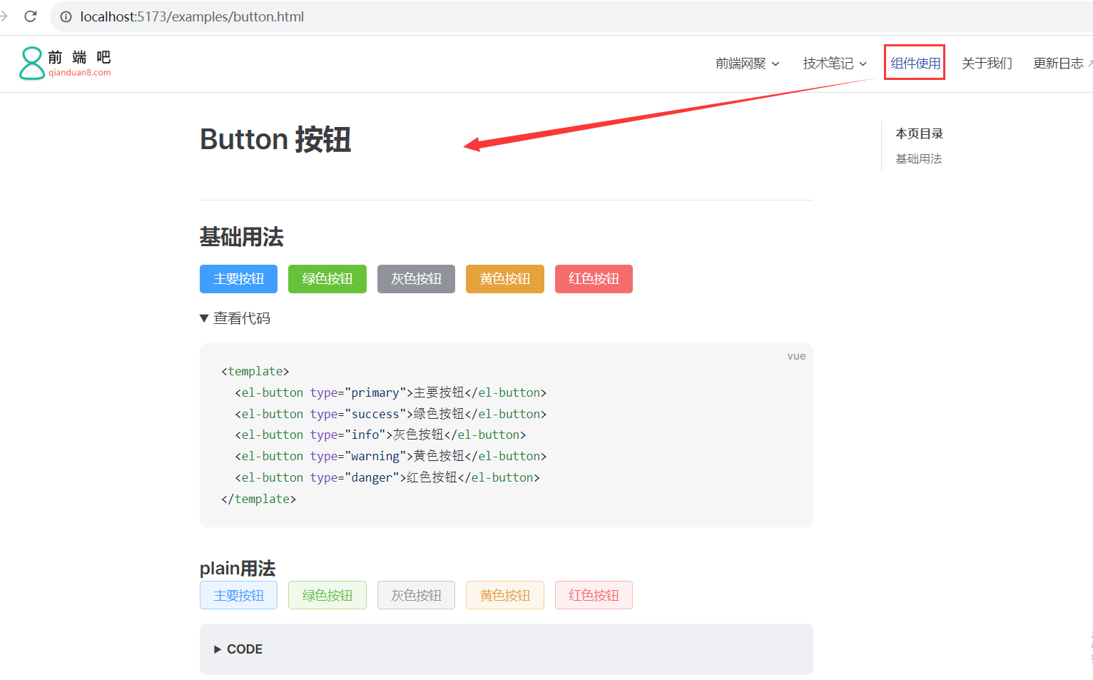
# Button 按钮

## 基础用法

<div class="ui-button">
  <el-button type="primary">主要按钮</el-button>
  <el-button type="success">绿色按钮</el-button>
  <el-button type="info">灰色按钮</el-button>
  <el-button type="warning">黄色按钮</el-button>
  <el-button type="danger">红色按钮</el-button>
</div>

<details>
  <summary>查看代码</summary>

``` vue
<template>
  <el-button type="primary">主要按钮</el-button>
  <el-button type="success">绿色按钮</el-button>
  <el-button type="info">灰色按钮</el-button>
  <el-button type="warning">黄色按钮</el-button>
  <el-button type="danger">红色按钮</el-button>
</template>
```

</details>


### plain用法

<div class="ui-button">
  <el-button type="primary" plain>主要按钮</el-button>
  <el-button type="success" plain>绿色按钮</el-button>
  <el-button type="info" plain>灰色按钮</el-button>
  <el-button type="warning" plain>黄色按钮</el-button>
  <el-button type="danger" plain>红色按钮</el-button>
</div>

::: details CODE

``` vue
<el-button type="primary" plain>主要按钮</el-button>
<el-button type="success" plain>绿色按钮</el-button>
<el-button type="info" plain>灰色按钮</el-button>
<el-button type="warning" plain>黄色按钮</el-button>
<el-button type="danger" plain>红色按钮</el-button>
```
:::
这里用到html5的details和summary标签,不了解的话可以去搜索看下。
然后配置一个“组件使用”的头部导航,效果如下:
github地址:https://github.com/msyuan/vitePress-project
